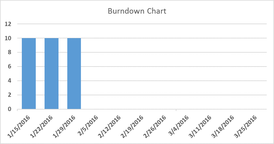
Virtually everyone who has ever been part of a team using Scrum or practicing Agile principles & practices knows what a Burndown Chart is. Burndown Charts typically look something like this:
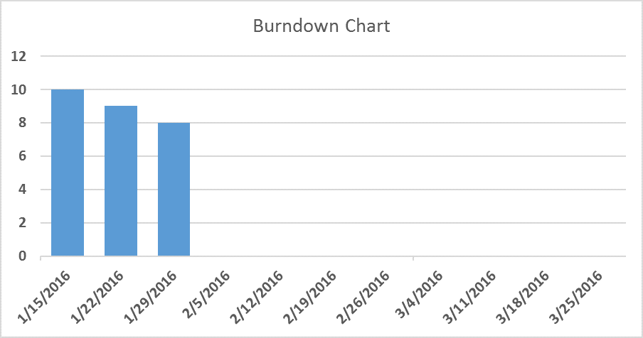
That is, a column chart with dates along the x (bottom) axis and numbers along the y (left) axis. The dates on the x-axis are usually the dates of each sprint demo (for Scrum teams) or some other interval, e.g., once a week. The columns show you how much product the team has left to build as of each particular date. Some teams denote this on the y-axis by the number of items (often called user stories) the team has left in its backlog. Some teams weight those items by story points and, thus, the y-axis shows the number of story points remaining in the backlog for each particular date.
Whether or not to use story points to weight a team’s metrics is a fascinating topic but should be left for its own blog post.
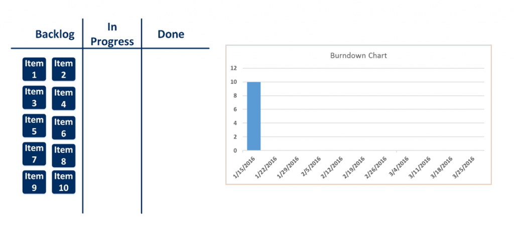
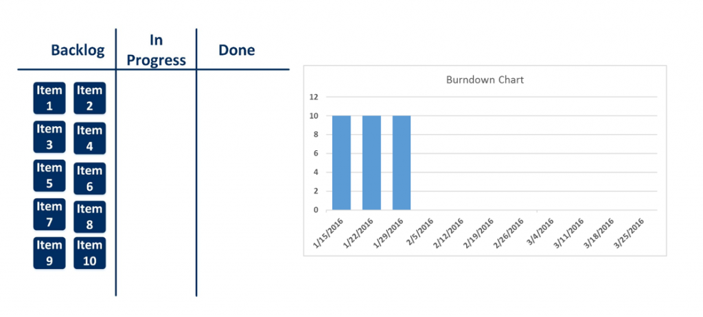
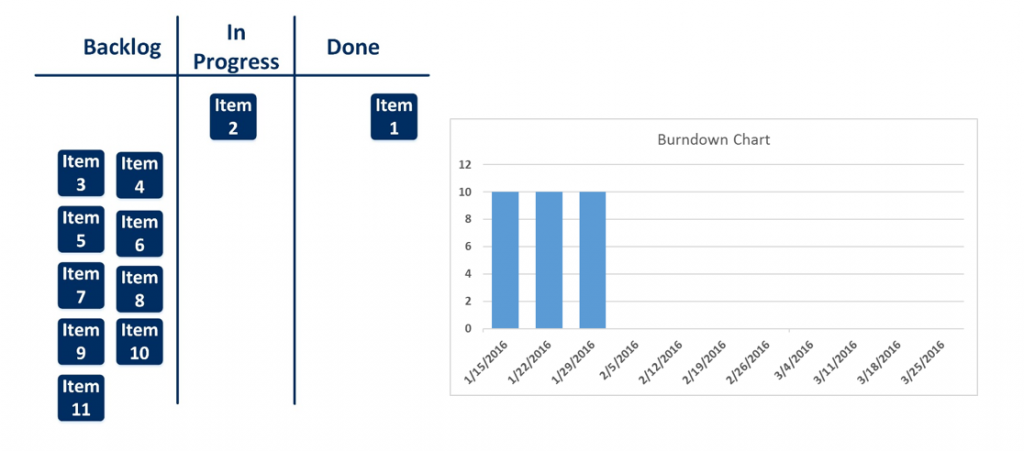
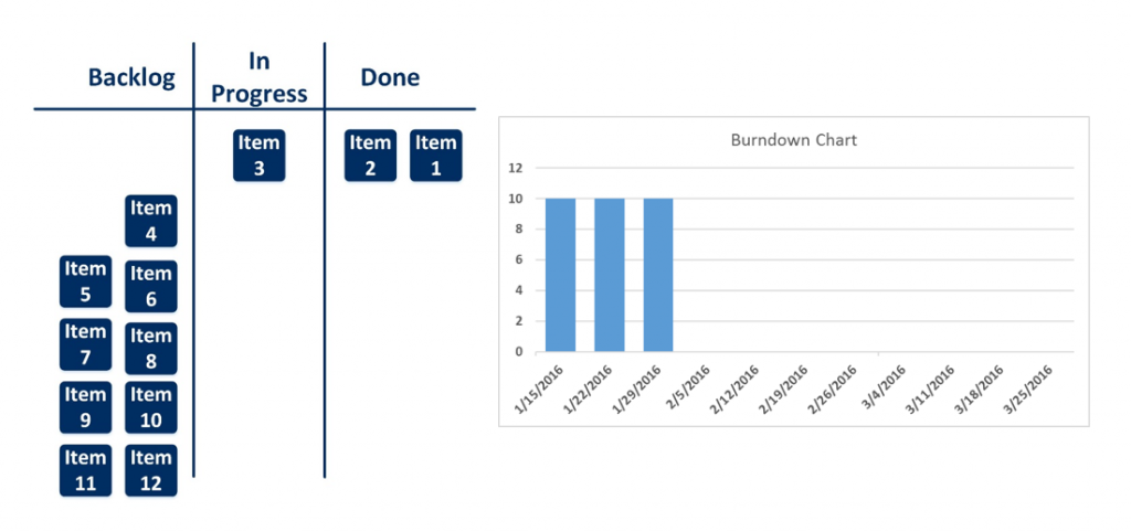
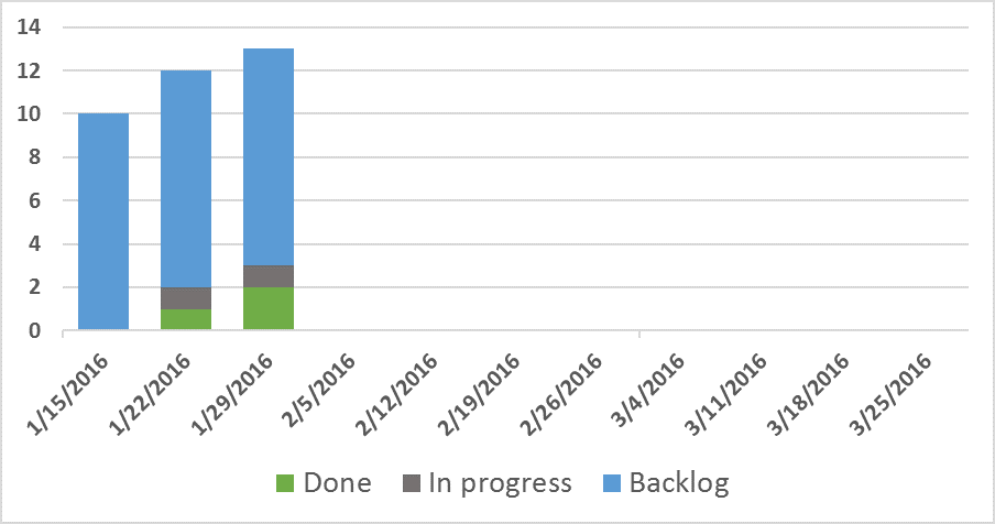
To generate a Burndown Chart, one simply checks the team’s Backlog on a cadence (daily, weekly, etc.) and records the number of items in that state, i.e., the Backlog:
1/15/2016
1/22/2016
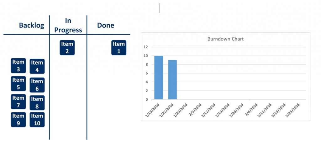
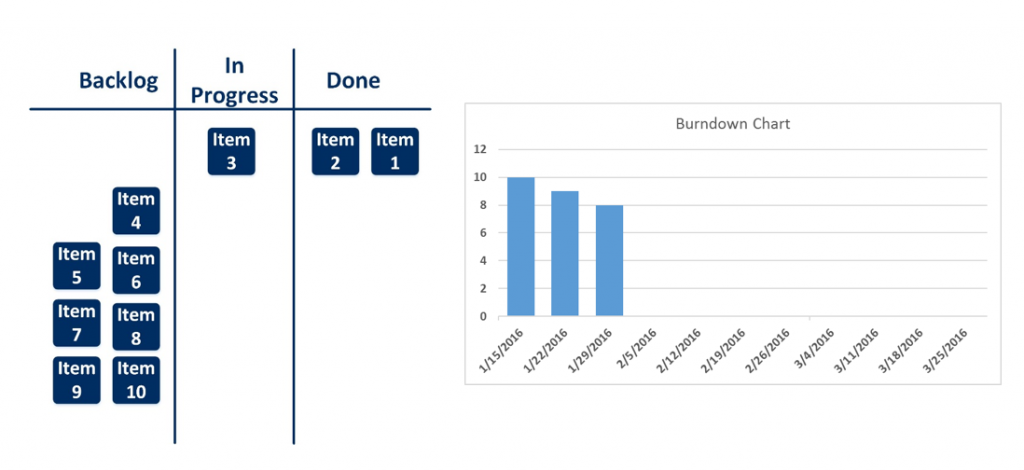
1/29/2016
The burndown chart is a great place to start when tracking metrics. It is very simple to put together and provides high-value information: how far away from the goal we are and how we’re trending. In fact, we might as well call Burndown Charts “Product Remaining To-Be-Built Charts”.
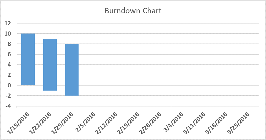
While this is great, teams quickly run into the inherent limitations of a Burndown Chart. For instance, what is going on with a team whose Burndown looks like this:
One might assume that the answer is “the team isn’t getting anything done.” The truth, though, might be that the team is producing extremely well – but additional items keep getting added to the backlog. Thus, at any given moment, the amount of product still be built is the same as it was the last time you measured it.
1/15/2016
1/22/2016
1/29/2016
Faced with this limitation, some teams instead use a Burnup Chart. Burnup Charts come at the question from the other side: how much product has been built. Thus, while one would like a Burndown Chart to always trend down and to the right, we look for Burnup Charts to move up and to the right:
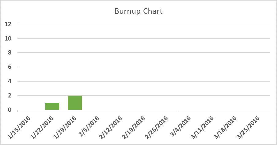
To generate a Burnup Chart, one measures the number of items in the team’s “Done” state instead of the team’s Backlog.
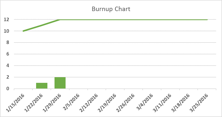
One can quickly see the downside (no pun intended) of the Burnup Chart – while we can now see progress even in the presence of a growing backlog, we can’t see how far from the goal we are. The most common solution to this is to add a line to the chart indicating where “done” is. As items are added to the backlog, the line moves up as well:
This addresses the problem of not being able to tell how much further the team has to go. Another solution to visualizing the phenomenon of a growing backlog was popularized by Mike Cohn in his book “Agile Estimating and Planning.” In short, we stick with a Burndown Chart but extend the columns below the x axis to indicate newly added items, thusly:
While this approach solves the basic problem, it leaves a lot to be desired, in my opinion. It violates basic principles of data visualization and, thereby, becomes less intelligible. A casual observer can instantly grasp what’s being communicated by a standard Burndown or Burnup Chart. This extended Burndown Chart requires a bit more explanation to be understood.
A Cumulative Flow Diagram (henceforth “CFD”) solves these problems and provides additional insight with only minimal effort. A CFD is based on the same data that underlies Burndown and Burnup Charts but a) includes some extra data, b) visualizes it in a better way, and c) enables more robust decision making. To illustrate this, let’s first combine our Burndown and Burnup Charts:
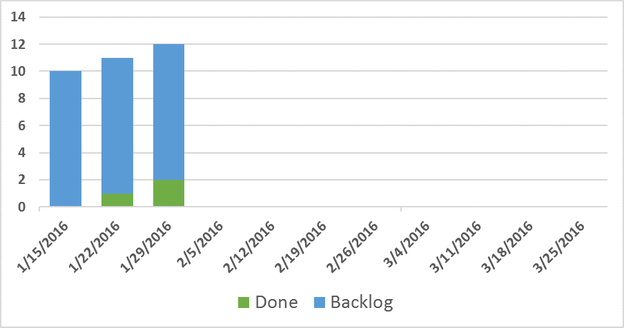
Note how this is still quite intelligible at a glance and yet gives us both sides of the coin. Now, every time we record how many items are in the Backlog and Done, let’s also record how many things are In Progress, thusly:
Finally, let’s visualize this as an area chart rather than a column chart:
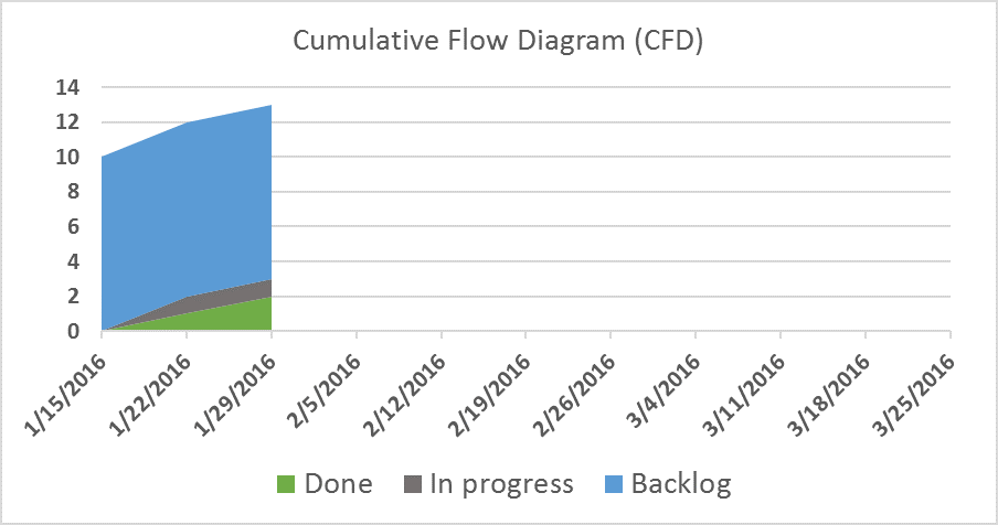
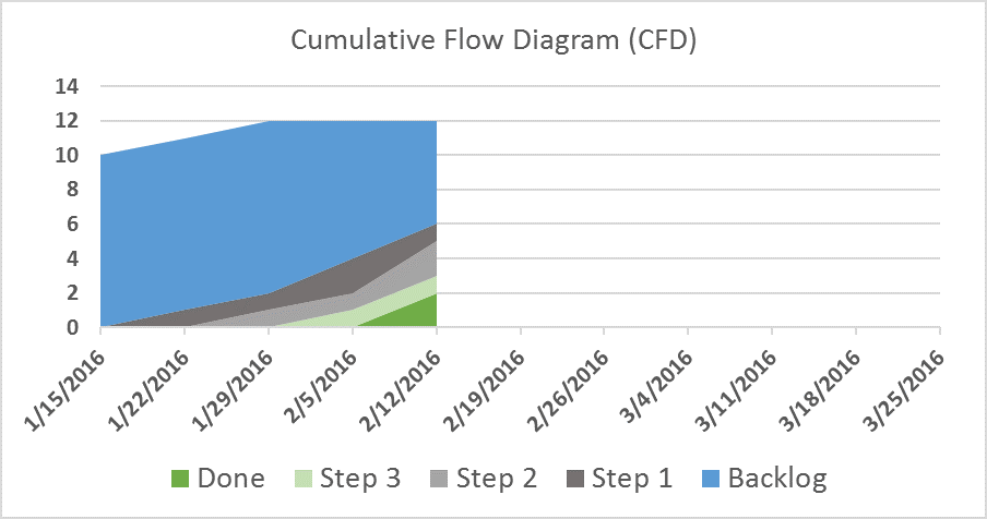
This is a Cumulative Flow Diagram. It’s simply a stacked area chart showing, at each time interval, the number of items in each stage of the process. As time goes by, the chart shows the flow of items through the process. We call it “cumulative” because we’re not measuring the incremental change from interval to interval – we’re always counting every item in each stage, regardless of whether it was in that stage during the last measurement.
As you can see, this solves the basic function of a Burndown Chart, handles a growing backlog more elegantly than below-the-axis columns, and simply follows the “done” line of a Burnup Chart to its logical conclusion. It’s also easier on the eyes.
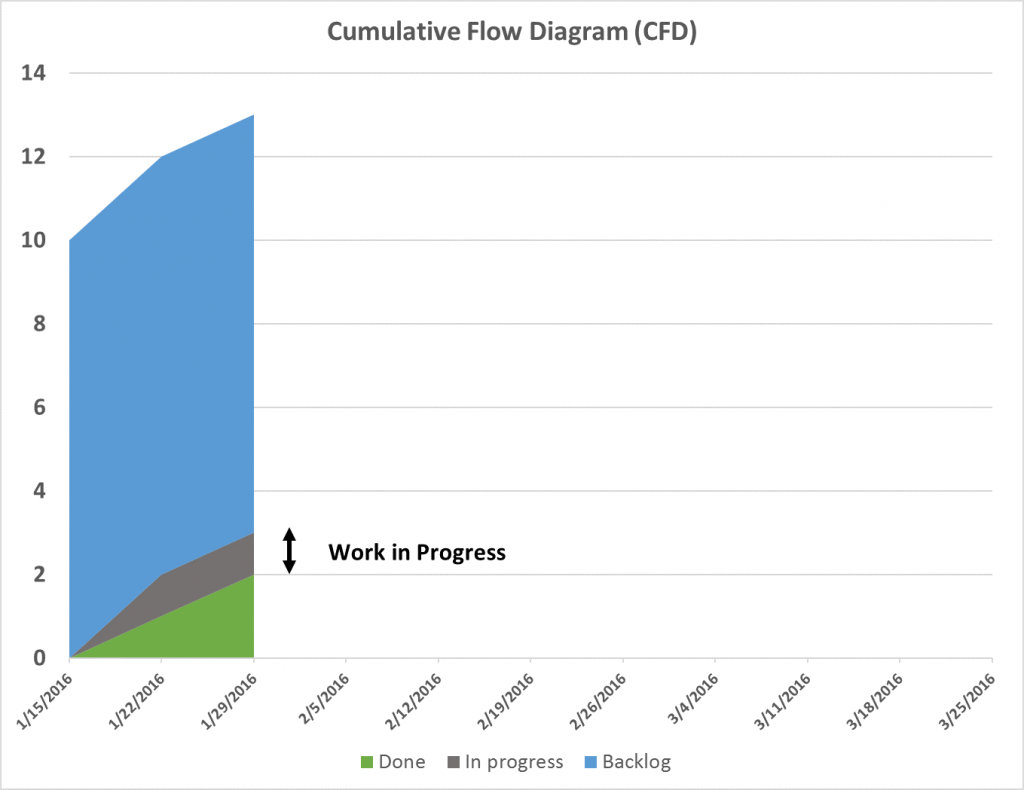
But the big paradigm shift in the CFD is that it exposes lots of critical flow information. For instance, we are now visualizing the amount of Work In Progress (WIP) at each interval. WIP is a critical concept in lean and agile thinking and focusing on it can dramatically improve a team’s ability to produce. The vertical height of each band is the amount of items (WIP) in that stage:
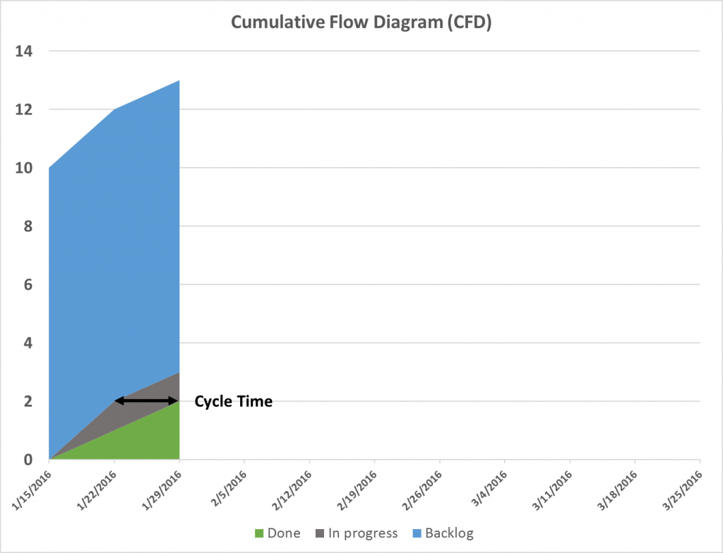
CFDs also expose our average cycle time (the amount of time it takes, on average, for an item to get from one stage to another. Cycle time is often a critical measure of success since downstream stakeholders or customers often put a very high premium on responsiveness, i.e., how long it takes from the moment they submit a request to the moment it is fulfilled. Visualizing this information in such a simple way and in conjunction with our other data enables much better decision making. One can see average cycle time by looking at the width of each band on the CFD:
The CFD can have as many bands as the team has stages in its process. For instance, for a board that had more columns, such as:
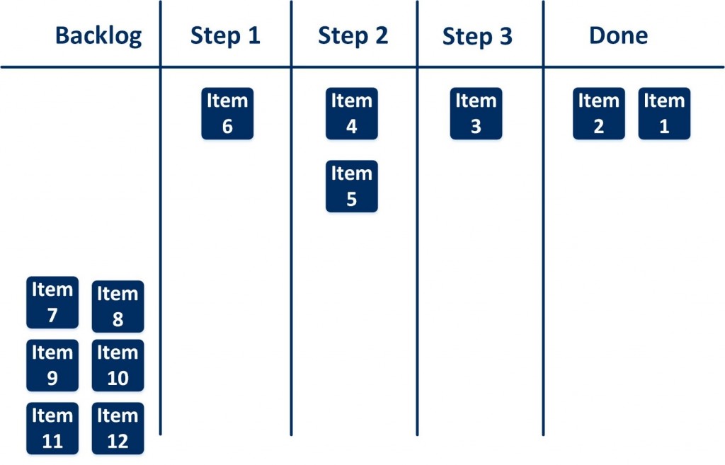
The CFD would look something like this:
In short, then, for just a little more effort than a Burndown or Burnup chart, a CFD provides a wealth of information and solves some of the inherent limitations of the former charts. It doesn’t solve everything, though. For instance, a CFD doesn’t tell us if any item is blocked, much less individual cycle time – meaning the amount of time a particular item has remained in a single stage.
To answer these question, we need additional information radiators more suited to those particular issues. But that’s another blog post…