
This year, approximately 17,000 data fanatics – or as Tableau refers to them, Data Rockstars – traveled to New Orleans, Louisiana for four days of learning about all things Tableau. Sessions included both technical and non-technical skills behind using the tool, but more importantly, it was four days of constant inspiration!
Here are the four most important things I brought home with me from #TC18:
1. Design With the User in Mind:
One breakout session I attended shared the design process as a four-step procedure to build a dashboard with the user in mind. As the presenter, Alyshia Olsen, facilitated, she included personal stories relating to each process, really honing into the importance of each step.
As a data viz developer, everything I develop is for a user. What purpose does the dashboard serve if my user’s needs are not met? Below is an overview of the four vital steps to take when designing.
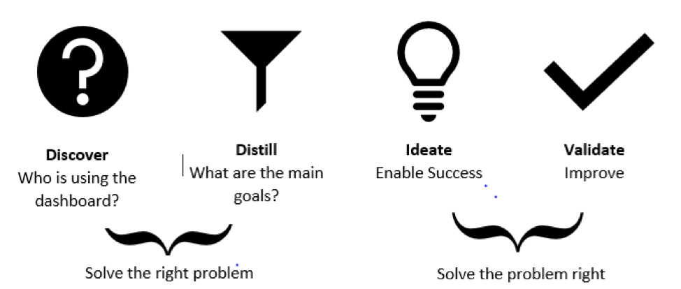
Figure 1. By Alyshia Olsen, User Experience Designer – Tableau
2. Integrating Data Science and Data Visualization in Tableau:
Tableau continues to evolve its analytics and data science capabilities, and the session focusing on the integration of data science and data visualization highlighted.
One oft-forgotten feature highlighted at the conference was the Analytics pane forecast option. Though it only gives the opportunity for “exponential smoothing,” this feature is great for simple forecasting to help users understand at least the direction their data is going towards. The second part of the session focused on R and Python, two leading languages for data scientists. Both R and Python can be integrated with Tableau by installing the “RServe” and “TabPy” consoles. Once installed, all the coding will be done in the chosen console. To connect to Tableau, a new calculation can be created using the simple and straightforward “script_*”.
3. You Want a “Disagreeable Giver” on your Team
One of my favorite sessions during the conference was the keynote given by Adam Grant, which focused on becoming a better team member. He highlighted that the best teammates are the “Disagreeable Givers” – the ones who question the status quo but have the best intentions in mind.
Grant stated that these types of team members are often undervalued but are the reason companies progress. This is especially important to remember when obtaining feedback on dashboards, and the team member is questioning the data, design, and charts. The disagreeable giver is not undermining you or trying to make you feel incompetent, but more so wants you to be the best data visualization developer you can be.
4. Amp Up Your Vizzes:
The last session I attended revolved around data viz tips for better dashboards. With the focus on developing the “perfect” dashboard, speakers reminded us that dashboards need to be clear, engaging, and sticky – in other words, memorable.
- Clear: Digestible and does not distract from the message
- Engaging: Familiar enough to draw attention
- Sticky: Good first impression and delightful to look at
In Summary:
This was my first time attending the Tableau Conference and I was in awe of all the great conversations happening around me. From those with a data focus discussing how to use Tableau Prep, to data viz enthusiasts stretching the capabilities of the platform to develop better visualizations, everyone wanted to learn and be inspired. The conversations and community off-stage were just as inspiring as those behind the microphones.